


Brief
This was a project from way back in my second year of college. I had to design a poster for the re-release of a classic FontShop typeface. I was assigned the font Quadraat which was designed by Dutch typographer Fred Smeijers.
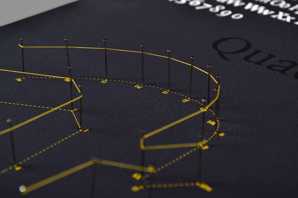
Outcome
I wanted to highlight the font's punch-cut origins through the use of pins and string, to recreate the forms of the letters on a magnified scale. The blue thread is a close up of a lowercase regular weight f. Pink is a bold w, and yellow is an italic m.

